When I started at Dialogue, I was fresh out of university and learning how to make my mark in the tech industry. You could say that Dialogue was going through a similar phase. Three years ago, we wanted to have a brand identity that was young, hip and fun. Now, Dialogue has established itself as a market leader and it was time for a more refined brand image.
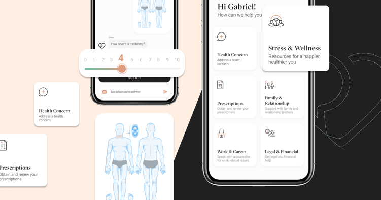
Over the years, our patient app has gone through countless iterations and facelifts. But none have been as significant as the completely reimagined, rebranded app that we recently launched. To most people, it might just be a few new colours, icons, and illustrations. But to us, it means so much more than that. It means capturing the essence of our new brand principles and transforming it into the user experience. Here, we dive into how we went from ideation to conception, and how rebranding had the surprising effect of changing the way the product team works for the better.
From idea to interface
These are Dialogue's brand principles, the North stars that guided us towards every design decision.
- We are pioneers
Our old branding was whimsical and trendy. While we cherished it, it was time for us to stop following trends and start setting them. So we set out to create a sophisticated, timeless user interface that would make us stand out from the crowd. - We are warm
From the peach accents to linen text to soothing gradient backgrounds, we carefully chose each colour to make sure that the palette embedded warmth into every step of your Dialogue journey. - We are principled
We do the right thing, not just what's expected. What started as a mere visual update became an opportunity to rethink and rework many components so that we could make the user experience more accessible and friendly. - We are experts
All of this came together for a new look and feel that we hoped would reflect our expertise in product development and design.
Saying goodbye to fifty shades of blue
With a good idea of the direction we wanted to take, our next step was to translate these principles into our product style guide. What is a style guide? It's a document that communicates the elements and rules that make up a product. For us at Dialogue, it contains:
- Colour palette
- Typography
- Iconography
- Illustrations
- Spacing rules
- User interface components
Think of it as Lego. Each category is a differently shaped piece. You have the freedom to mix and match different pieces to create new structures. There are rules that guide you to build, but sometimes we go rogue - breaking old rules and adding new ones - in order to innovate. With these foundational building blocks, you could create anything.
But our style guide system was disjointed because designers and developers weren't working from the same style guide. Picture this: the developers had a roller coaster Lego set, the designers had a gingerbread house Lego set, and we were trying to build a spaceship. Not impossible, but not ideal either. The bottom line was that not working from the same source of truth was slowing us down. That had to change! So we made the decision to bulldoze the old style guide and craft a new one from scratch - one that would create a common design language that everyone understood.
Colour me happy: our new style guide
We took our four brand colours and expanded upon them to cover all use cases in the app. Even so, we ended up with only 14 colours in the palette, a sizeable decrease from the 44 that we had before. While we cut down on colours, we amplified the level of detail to make the style guide as easy to understand as possible. After many rounds of feedback and iterations, this is where we have landed.

Why does all of this matter? Here's a software developer's take on it:
"With the trimmed colour palette and unification of the styling, the time and effort required to deliver a great looking feature has dropped dramatically. Everyone wins." - Nick Sulik, Tech Team Lead
The style guide will continue to evolve with time, but it is finally what we always hoped it would be. It’s an easy-to-understand, frequently consulted resource that enables us to build better, faster, and stronger. Designers and developers are finally sharing the same Lego pieces. This rebranding project had the unintended side effect of improving the way we work, and we're so glad it did. The less time we spend trying to navigate through ambiguity, the more time we can focus on improving the features that matter most to you.
Read more about our rebranding efforts from our VP Marketing, Jeff Gladwish, and our CEO, Cherif Habib.


 Canada (EN)
 Global (EN)


